Sunday, June 30, 2013
Friday, June 28, 2013
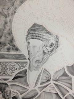
GIGANTIC LITHOGRAPH
What was I Thinking...I just began work on a humongous lithograph...28" x 42"...Here we go...
Gonna need a bunch of these...


Gonna need a bunch of these...


This is the black and white image printed on Somerset Satin paper...now I have the daunting task of filling this bad boy with color...wish me luck.
Back to the Mezzotints!
So after my adventures in lithography I have come back to the mezzotint world. Only now...I want color! I took what I was doing with my lithographs and found a way to get a similar result with my mezzotints...I began to Chine-collé photo litho elements into my mezzotint/aquatints...Check em out...
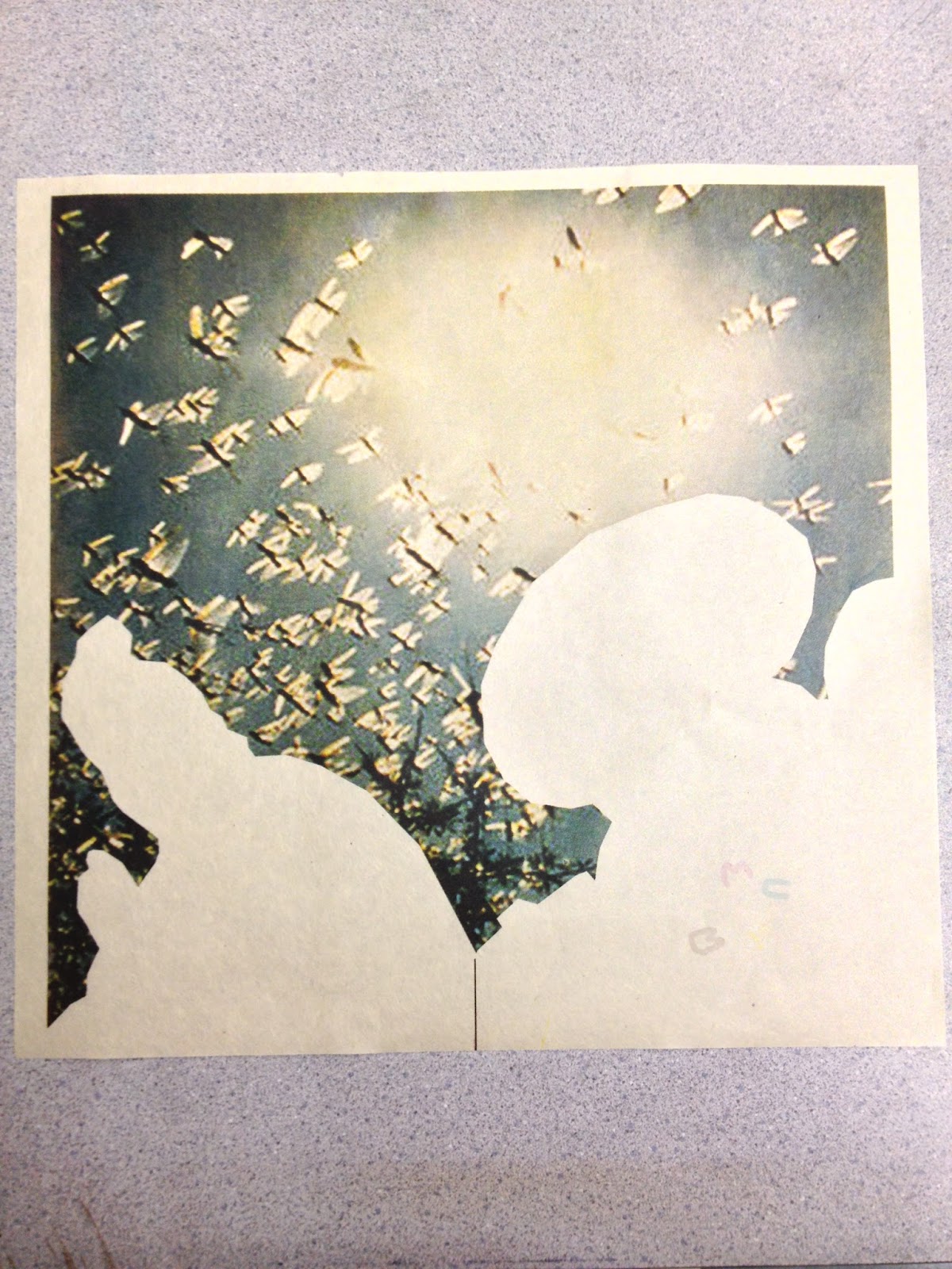
Here are some of the four color process photo litho elements printed on Kitakatat paper..
These will be cut out and chine-colléd once the mezzotint plates are completed...


 Here are some of the plates I've been working on...

 I proof my plates to make sure I have all the values I want...Next up is the fun part...Editioning!

 Here are the final prints...All of which are a combination of Mezzotint, Aquatint, Lithography and Chine-Collé.
 "Bundle Of Joy, Bundle Of Sticks"
 "On Earth As It Is In Heaven"
 "The Redundant Natur Of Evil"
 "Abaddon"

Here are some of the four color process photo litho elements printed on Kitakatat paper..
These will be cut out and chine-colléd once the mezzotint plates are completed...


"Baptéme Du Feu"
Frans Masereel Centrum in Belgium!!!
I had the unbelievable opportunity to spend two weeks in Belgium at the Frans Masereel Centrum making some prints. While there i completed a lithograph and a mezzotint...Here are the in progress shots...
 Lithography in Belgium!!!!!
 I need to draw more animals...This monkey is insanely fun to draw
 getting there...I couldn't get my hands on any "stones" brand crayons so I've been using Korn's...Im not a fan...Maybe it is the cold weather...but the Korn's are brittle and keep cracking.
 Completed drawing ready for autographic ink...
 Autographic ink? CHECK!
 Rolled up in black and ready to etch...
 I tried something new with this print...I printed the key image twice on top of itself...The first time I printed it in a greenish brownish swampy looking color...the I printed it right on top of itself in black...It was a pretty efficient way to get two colors out of one drawing...I will say this though...if you are going to try this...stretch your paper extremely well and USE PIN REGISTRATION!!!!
 FInished...my first lithograph in another country!!!


Oh yeah...I also made this little mezzotint while I was there...Though this was a finished print...I have a feeling it's just a study for "bigger" things to come.

They also let you put this sweet chop on all your prints!!!
"Stockholm Syndrome"
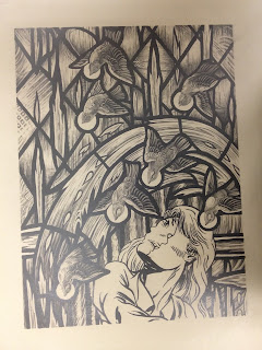
I am beginning a lithograph that will probably be the most technical print I have made in a long time...I plan on drawing multiple layers of rendered color rather than using large flats of color. Here are the in progress shots for "Stockholm Syndrome"
 Beginning the drawing...these little birds are a ton of fun to draw...

 Almost time for the autographic in...This step actually takes the longest. While using autographic ink prevents me from using a tone of crayons in the solid black areas...it is also super greasy. I have to be extremely care when applying it in order to avoid destroying the hours of drawing i just completed. I paint it on with a small paint brush which is tedious and nerve-racking.
 I carefully completed the image and it is now ready for the first etch.
 Here is the stone inked up in black and ready for the second etch.
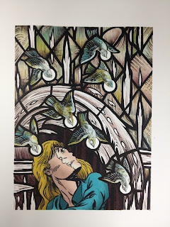
 Printed in "Trophies Brown" on Somerset Satin paper.
 Now to begin the color...I have drawn the first color layer (Yellow) on frosted mylar with stabillo pencils and exposed the drawing onto a photo plate.
 The second color is a greenish blue which overlaps the yellow o give me a variety of blues, greens, and yellows.
 A medium brown is printed to flesh out the patterns of the stained glass window in the background.
 I have now printed an antique brown over the entire background leaving out the birds, the figure in the foreground, and the flames.
 A layer of magenta rendering is added to give more dimension.
 Three skin tones help to create dramatic lighting on the female figures face.
 two more colors help to add tonal range to the figures clothing and hair.
 A deep red-brown push the depth and space around the figure.
 A flat grey is added to give dimension and detail to the flames...


Finished! Man...that was a lot of drawing and a lot of printing...15 colors
Subscribe to:
Posts (Atom)